 Arpit
ArpitIf you’re running a clothing brand or printing business in Canada, your final product quality depends heavily on one critical step — colour separation.
Whether you’re based in Toronto, Vancouver, or any growing apparel hub, poor colour separation can ruin even the best designs. Blurry prints, dull colours, and misalignment can instantly damage your brand image.
That’s why professional colour separation services are essential for modern screen printing in 2026.
What is Colour Separation in Screen Printing?
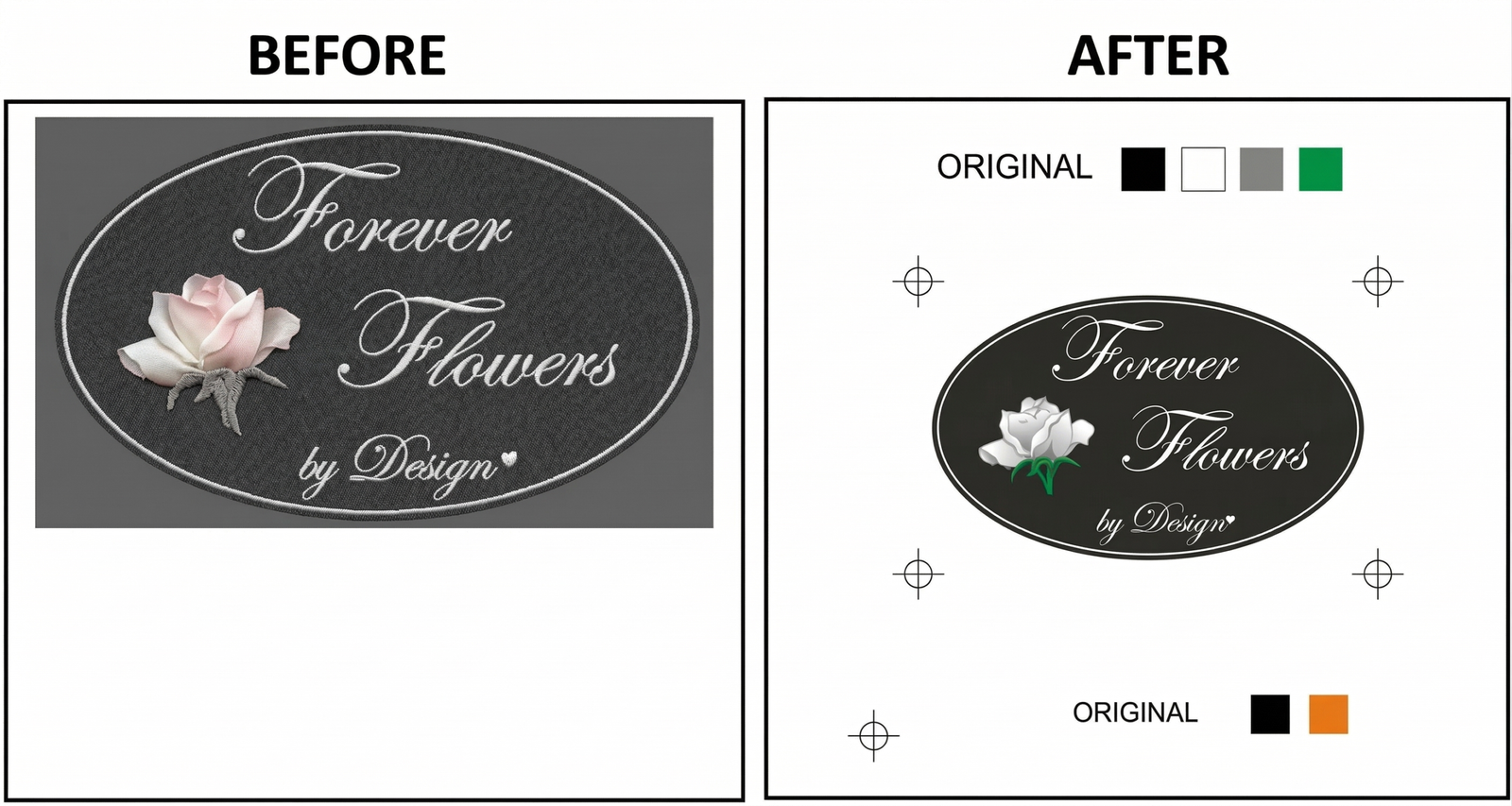
Colour separation is the process of breaking a full-colour design into individual layers, where each colour is printed separately using different screens.
In screen printing, every colour requires its own setup. Without proper separation, your design will not print accurately on fabric.
For Canadian apparel brands, this step ensures:
- Sharp print quality
- Accurate brand colours
- Consistent bulk production
Why Canadian Businesses Need Professional Colour Separation
The Canadian apparel market is highly competitive. Customers expect premium-quality prints, whether it’s for streetwear, corporate uniforms, or promotional merchandise.
Poor colour separation can lead to:
- Misaligned prints (registration issues)
- Faded or incorrect colours
- Low-quality finish
Professional services ensure your designs look clean, sharp, and retail-ready.
4 Types of Colour Separation Used in 2026
- Spot Colour Separation
Uses exact Pantone colours for solid prints.
Best for:
- Logos
- Branding
- Corporate apparel
Result: Clean edges and consistent colours across all garments.
- CMYK Process Separation
Uses Cyan, Magenta, Yellow, and Black to recreate detailed images.
Best for:
- Photographs
- Complex designs
- Light-coloured garments
- Simulated Process Separation
Advanced technique for printing detailed designs on dark fabrics.
Best for:
- Streetwear brands
- Dark hoodies and t-shirts
Result: High detail with soft print feel.
- Index Colour Separation
Uses pixel-based separation for unique textures.
Best for:
- Vintage designs
- Distressed artwork
Our Colour Separation Process
At Dream Embroidery, we follow a precise workflow to ensure high-quality output:
- Artwork analysis and correction
- Professional colour separation using advanced software
- Film output for each colour layer
- Screen preparation and exposure
- Final print production
Why Canadian Brands Choose Dream Embroidery
We support apparel businesses across Canada with:
- Fast turnaround times
- Bulk order support
- High-precision colour matching
- Experience with international clients
Whether you’re a startup or an established clothing brand, we ensure your designs print exactly as intended.
Real Example
We recently worked with a Toronto-based streetwear brand that needed detailed prints on black hoodies.
Using simulated process separation, we achieved:
- Sharp detailing
- Vibrant colours on dark fabric
- Consistent results across bulk orders
Related Services
FAQs
Does more colours increase cost?
Yes. Each colour requires a separate screen. However, smart techniques like halftones can reduce costs.
Can you match exact brand colours?
Yes, we use Pantone matching to ensure colour accuracy.
What is white underbase?
A white layer printed first on dark garments to keep colours bright and visible.
Which file format is best?
Vector files (AI, EPS, SVG) provide the best results for colour separation.